Would you say these lines move together?  That is, when one goes up, does the other also go up?
Or, do they move randomly, so that when one goes up, the other sometimes goes up and sometimes goes down?
Or do they move in opposition, so that when one goes up, the other goes down? What is your opinion?
I ask because these two lines demonstrate one of the beliefs-vs.-facts arguments we seem to endure all too often in economics. Perhaps because economics is intertwined with psychology, a science notable for guesses trumping facts — or lack of facts — that economics is so filled with myths.
Contrary to popular belief, which is taught in our schools by educated economists, here are some of the facts that are not taught:
Federal “debt” is not real debt. The federal government does not owe it.
The federal debt is infinitely sustainable. Federal “deficits” are economic gains.
The federal government neither needs, keeps, nor uses federal tax dollars or any other form of income.
The federal government cannot run short of dollars. The federal government creates new dollars, ad hoc, by spending.
The federal government does not borrow. T-bills, et al, do not provide the government with dollars. “How will you pay for it” never is a legitimate question regarding federal spending initiatives.
Gold is not, and never has been money. It is, and always has been, nothing but an ore. Federal government spending grows the economy. State/local government spending does not.
The debt ceiling does not put a ceiling on federal debt. Federal “trust funds” are not trust funds and they do not pay for federal spending.
Lately, because of massive spending by the federal government, you have begun to hear about the menace of inflation. The wrong belief is that federal spending causes inflation by increasing the money supply. It’s what you have been told thousands of times.
And it makes intuitive sense. After all, when you increase the supply of something without increasing the demand, the relative value declines. And you surely have seen photos of people, in hyperinflation-ravaged nations, carrying loads of currency in wheelbarrows.
But, in this case, intuition is misleading. Increasing the supply of money does not decrease its value. In the above graph, I do not see any sort of “together” movement. I do not see a cause/effect relationship.
Here is the same graph, except with labels attached. The blue line shows changes in prices. The red line shows changes in federal debt. I see peaks in one corresponding to valleys in the other.

From the above graph, it would be very difficult to deduce that increases in federal debt cause increases in prices. In fact, a better case could be made that increases in federal debt cause a decrease in prices, and that decreases in debt caused an increase in prices.
How is that even logical? I can visualize one possibility. Federal debt, which results from federal deficit spending, stimulates the economy, i.e. it stimulates business’s anticipation of demand.
Even today, businesses are ramping up production in anticipation of increased sales due to projected federal stimulus spending. Is it possible that this anticipation causes businesses to overshoot their production, leading to excess supply and reduced prices?
Perhaps, but for whatever reasons, federal deficit spending has not caused inflation, at least, not inflation above the Fed’s arbitrary, 2% goal.
Over the long term, prices have increased. There has been some inflation. And we know that federal debt has increased. Is this the cause/effect we have been told about?
Here are the same data viewed from another perspective, and with the addition of Gross Domestic Product (green). 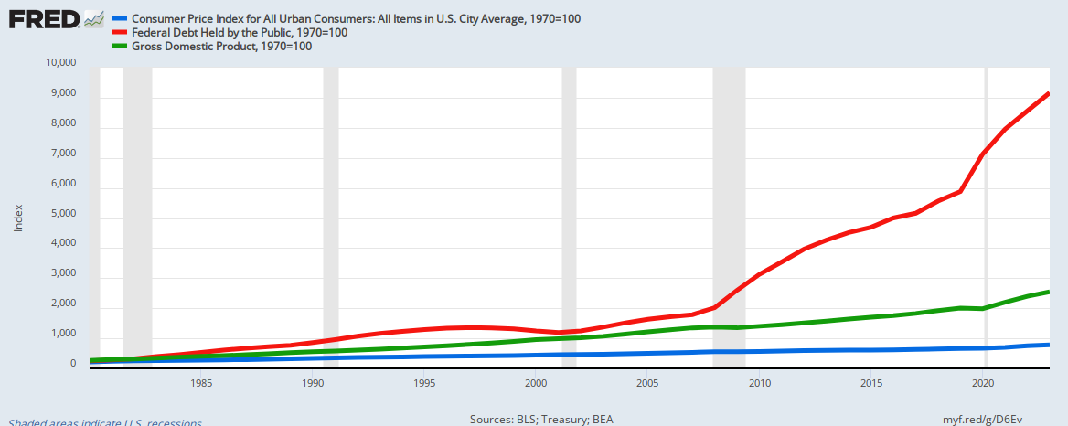 Since 1970, prices (blue line) have risen slowly, GDP (green) has risen faster, while federal debt (red) has risen massively. This indicates three things you will not hear from the media, the politicians or the expert economists:
- Even during massive debt increases, prices have moved up moderately, actually below the Fed’s target.
- As federal debt increases, GDP grows faster than inflation.
- The growing debt is not a burden on the government, on taxpayers, or on the economy.
Sadly, these facts will not sway those whose motive clearly is to widen the Gap between the rich and the rest.
By claiming that federal spending to support the poor and middle-income groups is unsustainable, the purveyors of the “Big Lie” help enrich the rich and impoverish the rest.
That is what the “Big Liars” are being paid to do. Rodger Malcolm Mitchell [ Monetary Sovereignty, Twitter: @rodgermitchell, Search: #monetarysovereignty Facebook: Rodger Malcolm Mitchell ]
===============================================================
THE SOLE PURPOSE OF GOVERNMENT IS TO IMPROVE AND PROTECT THE LIVES OF THE PEOPLE. The most important problems in economics involve:
- Monetary Sovereignty describes money creation and destruction.
- Gap Psychology describes the common desire to distance oneself from those “below” in any socio-economic ranking, and to come nearer those “above.” The socio-economic distance is referred to as “The Gap.”
Wide Gaps negatively affect poverty, health and longevity, education, housing, law and crime, war, leadership, ownership, bigotry, supply and demand, taxation, GDP, international relations, scientific advancement, the environment, human motivation and well-being, and virtually every other issue in economics. Implementation of Monetary Sovereignty and The Ten Steps To Prosperity can grow the economy and narrow the Gaps: Ten Steps To Prosperity:
- Eliminate FICA
- Federally funded Medicare — parts A, B & D, plus long-term care — for everyone
- Social Security for all
- Free education (including post-grad) for everyone
- Salary for attending school
- Eliminate federal taxes on business
- Increase the standard income tax deduction, annually.
- Tax the very rich (the “.1%”) more, with higher progressive tax rates on all forms of income.
- Federal ownership of all banks
- Increase federal spending on the myriad initiatives that benefit America’s 99.9%
The Ten Steps will grow the economy and narrow the income/wealth/power Gap between the rich and the rest.
MONETARY SOVEREIGNTY

If you want to see how strongly or weakly federal debt and inflation are related, you could plot the percent change YoY for Federal Debt vs. percent change in CPI and calculate the correlation coefficient (R), which is a numerical measure of how strong a relationship there is between two variables. R can vary from -1 to 1, with a value of 1 or -1 indicating perfect correlation. A negative correlation coefficient simply means the two variables are inversely related, meaning as one goes up the other goes down.
Squaring the correlation coefficient (R-squared) gives an index that measures how predictive the relationship is between the two variables. In other words how much of the variation in an independent variable (in this case federal debt) can explain, or account for, the variation in a dependent variable (in this case inflation or CPI). An R-squared = 1, means perfectly predictive, and an R-squared = 0.5 means the variation in the independent variable can only explain 50% of the variation in the dependent variable, and other independent variables are needed to explain the remaining variation. R-squared > 0.75 indicates a very robust correlation, and R-squared < 0.2 means weak to no correlation.
Given that, I went ahead and downloaded the data from the FRED website for Federal Debt and CPI and calculated the correlation coefficient and R-squared values between the percent change in these two variables. The result is an R-squared = 0.0004 (R=0.02), which is 0 for all intents and purposes, meaning there is absolutely no correlation or predictive strength whatsoever between change in federal debt and change in inflation over the past 40 years.
The fact that you can see the peaks of one variable coincide with valleys of the other in several parts of the graph, could be suggestive of an inverse or negative correlation as you stated, but that does not appear to be the case. It is more likely indicative of an additional variable or variables at play, such as change in GDP or unemployment, that would tend to have opposing effects on federal debt and CPI.
LikeLiked by 1 person
Thanks, B. Gray, for doing the labor.
Eyeballing the graph, as I did, not only is my lazy man’s way, but it helps take into consideration time.
For instance, it shows whether a possible cause has an effect one year later, two years later, etc. You would have to rerun your relationship several times, just to make sure that, for instance, changes in debt didn’t cause inflation, 6 months later, or 1 or 2 years later.
Being old and getting lazier every day, I just took the two graphs and slid them back and forth to see if I visually could detect any matches.
None. (Although a funny little thing happens in the early years, that could make one believe that inflation causes debt, rather than the other way around. The effect disappears later, though.)
Now check this out: https://fred.stlouisfed.org/graph/fredgraph.png?g=D8cf
It’s a comparison between inflation (blue line) and oil prices (red and green lines).
I strongly suspect that if you went through the statistics you would find a strong mathematical correlation between oil prices and inflation. And what directs oil prices? Scarcity.
Inflation is caused by scarcity, usually of energy or food, and certainly not federal debt.
Thanks for doing the work I didn’t do. Much appreciated.
LikeLike
Being a bit of a data and statistics geek, I went ahead and checked out oil prices vs. CPI and the R-squared was 0.28, which is a moderate positive correlation. Also, if I phase the CPI by one month to account for lag between oil prices and impact to other consumer prices, the correlation improves to an R-squared of 0.33. This basically means that about 1/3 of the variation in CPI can be explained by variation or changes in oil prices.
Your comment about delayed effects got me thinking more about the original debt vs. CPI analysis. We know that changes in federal deficit spending tend to be counter cyclical, in that deficits and federal debt tend to increase in response to recessions when deflation is the concern, and decrease when GDP and inflation are (relatively) high. We also know that reductions in federal deficits (and associated changes in debt) can lead directly to recessions and deflation, and subsequent increases in deficit spending helps to reverse this trend. This likely accounts for the association of peaks and valleys in the original debt vs CPI chart either preceding or immediately following recessions. Since both GDP and CPI tend to trend together over time (with some lag), we should expect to see some non-zero correlation between federal debt and CPI if we account for some degree of lag between federal deficit spending (or lack thereof) and its impact to the broader economy (i.e. GDP –> CPI).
I actually went back and rechecked the federal debt vs. CPI to see how the correlation improves by phasing CPI relative to federal debt. It turns out we see a maximum R-squared of about 0.16 with a 10 month lag between change in federal debt and change in CPI. Obviously oil prices have a much greater and more immediate impact on CPI than federal debt, but there is a non-zero correlation between federal debt and CPI nevertheless, especially in relation to recessionary periods. Otherwise, there would be no impact of federal deficits on recessions, which we know is not the case.
LikeLike
Good work. Interesting.
Actually, when I look at https://fred.stlouisfed.org/series/CPIAUCSL#0 it seems that the relationship would be even closer than .33. But point made.
LikeLike
I’m of the opinion that over the last century people have become survivalists–bread-and-butter specialized and less and less concerned about whole picture economics and academics. For them, it’s only about how to make a buck. The graphs and equations ??? As much as monetary sovereignty is good and logical, the “grasp and desire” of it isn’t there. I’m sure the power structure loves that; our ignorance is their bliss.
My question is: By what circumstances do we break through to the truth? Could it be that it’s a matter of evolution for which we have NO control, except to wait and see and roll the dice.
LikeLike
I believe that if the President of the United States used his powerful megaphone to explain the facts, there would be an immediate change in public opinion, especially if he had a couple of economists at his side. What we have been lacking is that powerful megaphone.
LikeLike