Economic austerity causes civil disorder. Reduced money growth cannot increase economic growth. Those, who do not understand the differences between Monetary Sovereignty and monetary non-sovereignty, do not understand economics.
====================================================================================================================================================================================================
I use graphs to make my points. Graphs allow readers to visualize the data, but graphs can be misleading. While I try very hard not to mislead, I always am aware I inadvertently could be making a nonexistent point. The old line, “Figures don’t lie, but liars figure,” was never more true than with graphs.
Look at this graph. It’s one of the most common — and deceptive — types of graph. You will see it every day in magazines, newspapers and blogs

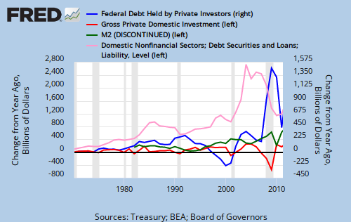
It shows four lines, all rising, three of which essentially are parallel. All four use the same scale, “Billions of Dollars” on the left. Looking at this graph, one could “prove” that Federal Debt Held by Private Investors, M2 and Gross Private Domestic Investment move together, while Total Domestic Nonfinancial Sectors moves up more rapidly.
The problem with this graph is the fact that it uses the same scale for all four variables, and the scale blurs out the real differences. America has grown over the years. So most of its measurements have grown.
But here is exactly the same graph, with one variable removed.

Those three variables that seemed to move together, look a lot less together.
Then there is the following graph. One more variable is removed, and the scale now is % Change From Year Ago. Remember, the basic data are the same. Suddenly, there is no relationship between the two remaining variables. They don’t move together at all.
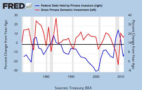
Now look at the following graph, which uses exactly the same data as the first graph, above. Rather than “Billions of Dollars,” the scale now is % Change From Year Ago, and Federal Debt Held by Private Investors is scaled on the right.

Then there is this graph, which again, uses the same data, except it now shows Change from Year Ago in billions of dollars. Again, the same data as above:
And the following graph, again the same basic data, just moving one variable to the right hand scale:

I could go on and on, but you get the idea. Demonstrating a point with graphs is a great way to educate, but it can be tricky. The most well-intentioned graph can make a misleading point, even when the data are completely accurate. All of the above graphs use the same basic data, yet all look substantially different. Different conclusions could be drawn from each of them.
Graphs are analogies. They are not reality. They only purport to represent reality. So the next time you see a graph (even mine), ask yourself, “Are the data shown in a way that fairly makes the point?”
Rodger Malcolm Mitchell
http://www.rodgermitchell.com
![]()
==========================================================================================================================================
No nation can tax itself into prosperity, nor grow without money growth. Monetary Sovereignty: Cutting federal deficits to grow the economy is like applying leeches to cure anemia. The key equation in economics: Federal Deficits – Net Imports = Net Private Savings
MONETARY SOVEREIGNTY

Unfortunately, it is quite common to use graphs to intentionally mislead, and relatively few people have the wit or access to the data to detect the dishonesty. Thanks for the reminder.
LikeLike
Right, Murray,
It even can be unintentional. Often I construct various graphs, just to see possible correlations, or non-correlations. When I see something that looks interesting, I try to analyze different ways of looking at the same data, in case something is a mere artifact of the graph construction.
Graphs are analogies. They are not reality. They only purport to represent reality.
Rodger Malcolm Mitchell
LikeLike
This is fantastic. I’ve recently started following your blog, and this sort of honesty about methodology is almost unprecedented among economic arguments. When I first read some of your posts, I actually started wondering about the way axes were labeled and had to think about whether your graphs accurately made the point you were trying to make. But it’s great to know that you’re thoroughly thinking through such issues.
Statistical and graph manipulation is obviously a problem in any field that uses data. I wouldn’t quite say that graphs are analogies; they are more like interpretations of data. In the same way you might select a certain trend or a few variables to discuss in an essay, a graph can do the same thing. Obviously what you choose to write about and how you construct your argument can color the impression your essay creates. By selectively choosing the points you make or using persuasive language, you can lead your reader to various conclusions (even completely opposite ones) from the same starting point. What you do in a graph is similar — it just seems more abstract and “technical.”
In the end, graphs are constructed to tell a story. For that purpose, they may intentionally or unintentionally misrepresent information. But it’s also important to add that they can tell stories with more or less clarity. I think that’s what a person who starts fiddling with axes scales (as you do here) is usually trying to do, but one just has to be aware of the data manipulation that is going on at each stage of graphical modification.
LikeLike